AN ARGUMENT FOR COLOUR
Why Be Afraid Of Colour?
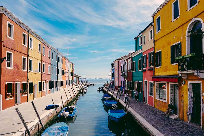
The thing about colour is we can be too fearful and miss out on the energy and fun that vibrant shades can offer. On buildings this is especially so – many people are so afraid of getting it wrong that they become paralysed by indecision. That’s when beige and grey become the default setting for ‘good taste’ and we find that we are wading through a dreary urban landscape. Colour has the power to elevate our mood, change our emotions and, when applied to the urban landscape, can even entirely change the personality of its society.
The case of Tirana, Albania
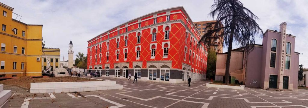
Take Tirana, Albania for example. After 50 years of isolationism it had become a dense urban sprawl of concrete in depressing hues of non-colour, with high crime rates and many other problems that faced that post-communist country. Change began when Edi Rama, the mayor of Tirana between 2000 and 2011, issued an edict that saw the city’s buildings painted in bright, vivid colours. This affected the city’s residents so much they became proud to call the city home and Tirana experienced a subsequent drop in crime.
I’m not saying that a stronger colour scheme is the answer to all society’s ills or asking Nelson City to become New Zealand’s answer to Tirana, Venice, or Wroclaw, but I do advocate for a braver approach to colour. It can’t hurt Nelson’s image as a progressive, arty little city.
State Cinemas Nelson Repaint
This year I was asked to research and choose a new colour scheme for the State Cinemas Nelson building. My initial brief was to keep the current colour scheme, but I was to find a yellow that wasn’t as lemony as when the initial paint job was done. It was allowed that I could propose an even bigger change (though staying within a yellow colour scheme) if I could provide a good argument for it. I spent some time researching yellow buildings, mocking up the building in various shades of yellow and came to the conclusion that we should be brave; reverse the intensities of the main and trim colours, choosing a warm, strong main colour with light trim and fascia. The building is, in essence, art deco and, like the Embassy Cinema in Wellington, it has the ability to hold colour – so why not?
The actual choice of yellow was more difficult. I looked at a staggering variety of yellows, from tints light to dark, from hues red to green. I spent some time vacillating between two that weren’t quite right. Talking to the excellent local Resene Colour Specialist proved helpful. She was able to search past seasons’ colours in which we found a yellow that hit the nail on the head and she further helped pair it with a light cream for the trim and fascia.
No matter which colour or shade chosen, there will be detractors. People love to vent and highly visible buildings like the State Cinemas Nelson building are a prime target for comment. So to the detractors I say, go back to your beige homes and enjoy the clean Spanish White walls that make you so happy – I get that it is calming and clean. But let the public enjoy the energy and warmth that the State Cinemas Nelson building offers in its glorious cloak of yellow. It is after all a place of entertainment, not of contemplation.
Applause to the owners and management for their vision and bravery and I look forward to many film viewings in the years ahead in our beautiful Nelson State Cinemas building.